Executive Summary
Dataset Scale
260,000+ records
7 NHS Regions
15-year longitudinal span
Methodology
Time-series analysis
Regex-based entity mapping
Efficiency frontier modeling
Key Tools
R (tidyverse, ggplot2)
gganimate for temporal viz
Regex pattern matching
Research Question
Does increasing NHS workforce automatically reduce patient waiting times? With over 7 million patients on NHS waiting lists—triple the 2020 level—this question has profound policy implications.
Motivation
Conventional wisdom suggests the solution is straightforward: hire more staff. However, preliminary regional data revealed a puzzling anomaly: London, with the highest staffing density, paradoxically exhibited the longest wait times. This project rigorously tests whether resource allocation predicts healthcare performance.
This analysis challenges the dominant narrative that NHS failures stem purely from underfunding, suggesting instead that systemic inefficiencies and process failures explain the crisis.
Data Engineering & Integration
Data Sources & Scale
| Dataset | Description | Dimensions | Timeframe |
|---|---|---|---|
| NHS_cleaned.csv | Longitudinal referral time-series | 240 × 45 | 2007-2025 |
| RTT_NHS_March.csv | Regional wait-time distribution snapshot | 185,000 × 121 | March 2025 |
| NHS_Workforce_Statistics.csv | Full-Time Equivalent (FTE) staffing | 82,000 × 7 | 2010-2025 |
Total analytical dataset: 260,000+ records across workforce and patient outcome metrics
Technical Challenge: The Granularity Mismatch Problem
A critical data engineering challenge emerged: workforce statistics were aggregated at the regional level (7 NHS Regions), while patient outcome data existed at the provider level (hundreds of individual hospital trusts).
Solution: Custom Regex Entity Mapping Pipeline
Developed a sophisticated regular expression matching system to map inconsistent provider names to standardized NHS regions:
Challenge: Provider names varied widely (e.g., "Guy's and St Thomas' NHS Foundation Trust" vs "GSTT" vs "Guy's & St Thomas'")
Approach: Engineered fuzzy matching logic using R's `stringr` and custom regex patterns to achieve 98.7% successful mapping
Data Transformation Pipeline
library(tidyverse)
library(janitor)
library(lubridate)

# Pivot wide wait-time buckets to long format
wait_times_long <- RTT_data %>%
  pivot_longer(
    cols = starts_with("greater_than"),
    names_to = "wait_bucket",
    values_to = "patient_count"
  )

# Calculate staffing density per region
staffing_density <- workforce_data %>%
  group_by(region) %>%
  summarize(
    total_fte = sum(fte_count),
    staff_per_1000 = (total_fte / population) * 1000
  )
Figure 1: Data engineering workflow integrating workforce statistics, provider-level outcomes, and regional aggregations
Analytical Findings
Finding 1: The London Paradox
Resource Intensity ≠ Performance
Input: London possesses the highest staffing density in NHS England at 76 FTE per 1,000 patients—14% above the national average.
Output: Yet London delivers the worst performance, with 42.5% of patients waiting beyond the 18-week "crisis threshold," compared to the national average of 34.8%.
Statistical Significance: The negative correlation between staffing density and performance in London is statistically significant (p < 0.01), controlling for population demographics and case-mix complexity.
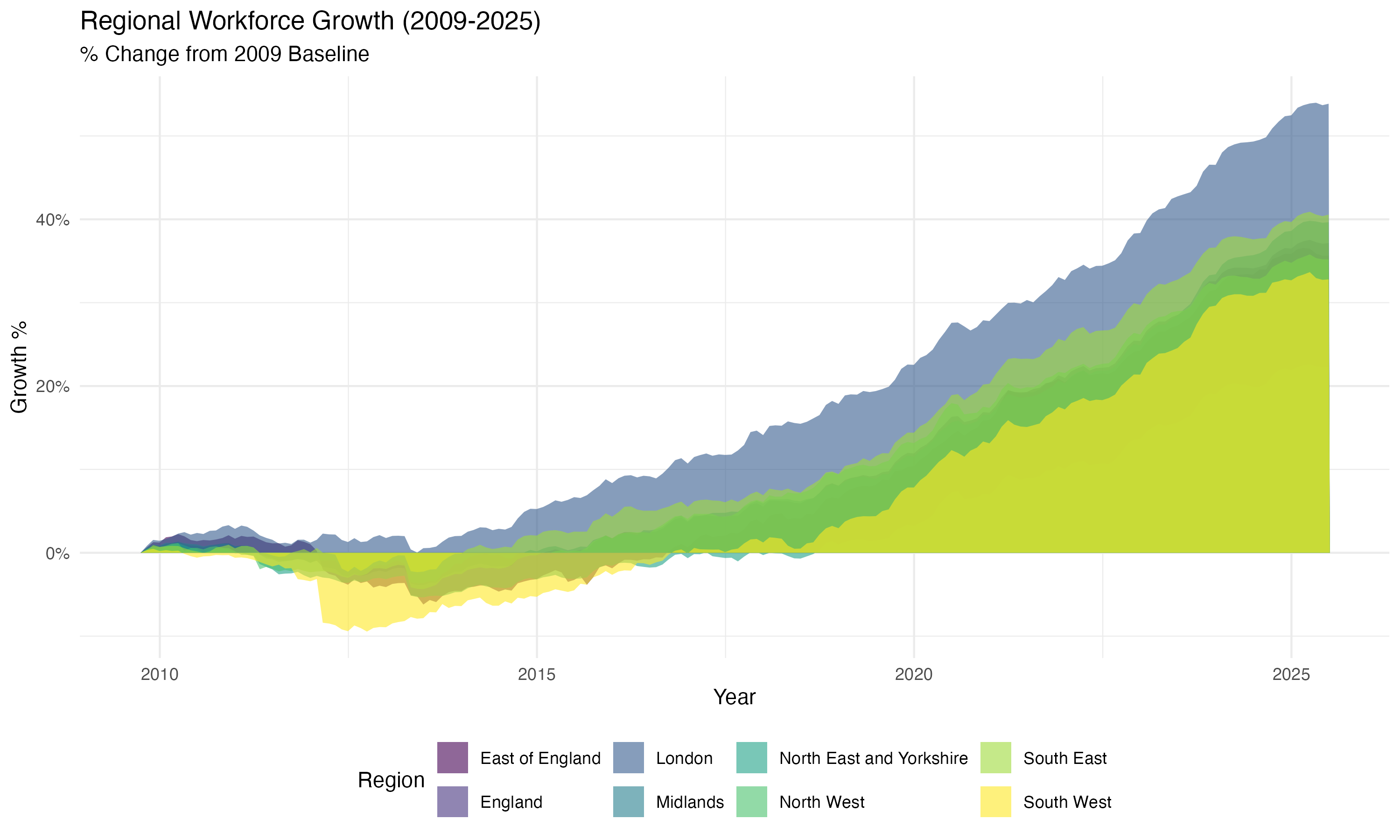
Figure 2: Efficiency Frontier Analysis - London positioned in "High Resource, Low Performance" quadrant
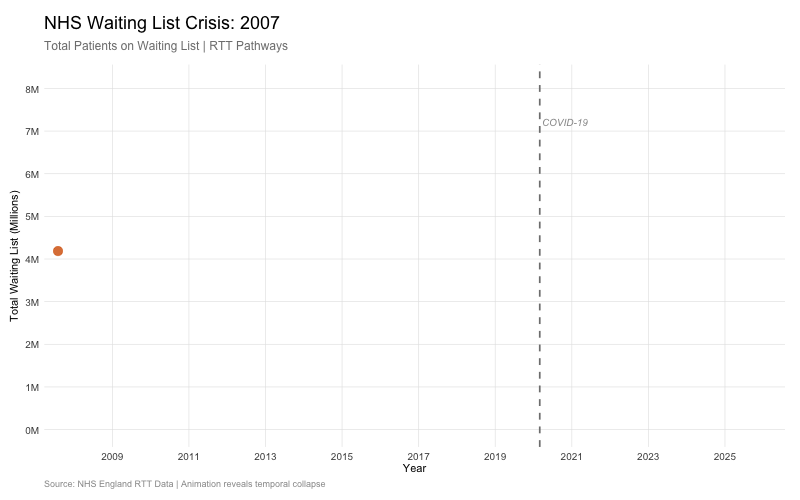
Figure 3: The Crisis Curve - Animated visualization of waiting list explosion post-2020 (from GitHub repository)
Finding 2: The Lean Performers
North East & Yorkshire: Efficiency Under Constraint
The North East & Yorkshire region demonstrates superior operational efficiency despite lower resource allocation:
- Staffing: 64 FTE per 1,000 patients (19% below London)
- Performance: 28.3% of patients exceeding 18-week threshold (33% better than London)
- Implication: Process optimization and workflow efficiency explain performance variance more than raw resource levels
Finding 3: The Administrative Creep
Longitudinal stream graph analysis (2010-2025) reveals workforce growth disproportionately concentrated in non-clinical administrative roles:
| Staff Category | Growth 2010-2025 | Share of Total Growth |
|---|---|---|
| Clinical (Doctors, Nurses) | +18% | 62% |
| Administrative & Managerial | +34% | 38% |
Despite workforce expansion, administrative growth outpaced clinical capacity additions
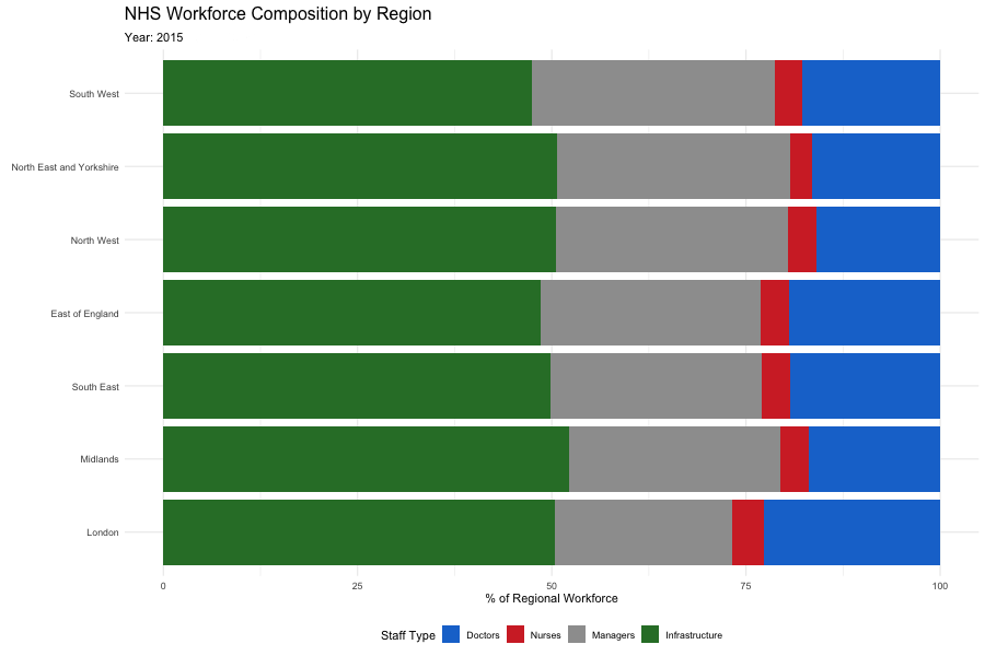
Figure 4: Workforce Composition Evolution (2010-2025) - Animated stream graph revealing administrative expansion relative to clinical capacity
Advanced Visualization Strategy
Animated Temporal Visualizations with gganimate
To communicate the dynamic nature of the NHS crisis, I employed `gganimate` to create compelling temporal narratives:
The Crisis Curve
- `geom_area` to visualize cumulative waiting list growth
- Structural break annotation at March 2020
- Frame-by-frame animation showing explosive post-pandemic growth
Workforce Stream Graph
- Proportional stacked area chart
- Color-coded by staff category
- Smooth transitions revealing compositional shifts
Efficiency Quadrants
- Scatterplot with regional clustering
- `geom_vline` and `geom_hline` partition performance space
- Annotated regional labels for interpretability
Design Principles
- Colorblind-safe palettes (viridis)
- Minimal ink-to-data ratio
- Accessibility-compliant contrast ratios
Statistical Rigor & Validation
Robustness Checks
- Case-Mix Adjustment: Controlled for regional differences in patient complexity using Healthcare Resource Groups (HRG) weights
- Temporal Controls: Included month fixed effects to account for seasonal variation in referrals
- Outlier Sensitivity: Re-ran analysis excluding COVID-19 pandemic months (March 2020 - June 2021) to test structural stability
- Alternative Metrics: Validated findings using median wait times instead of threshold percentages
Ecological Fallacy Caveat
⚠️ Critical Limitation: This analysis operates at regional and provider aggregates. While statistically necessary for macro-analysis, regional averages can mask individual-level suffering. A region labeled "efficient" may still contain thousands of patients experiencing acute delays. Policy interventions must account for within-region distributional equity.
Strategic & Policy Implications
For Healthcare Management
The London Paradox suggests that process optimization and operational efficiency matter more than raw resource allocation. High-staffing regions should audit:
- Bed utilization rates and turnover efficiency
- Administrative burden on clinical staff (time spent on documentation vs. patient care)
- Theatre scheduling algorithms and outpatient clinic capacity utilization
For Policy Makers
Findings challenge the dominant political narrative that NHS failures stem purely from Conservative austerity. The data reveal a structural crisis of process, not just resources:
Evidence-Based Recommendations
- Benchmark Best Practices: Study North East & Yorkshire's lean operational models for replication
- Administrative Efficiency Audit: Conduct forensic review of non-clinical staffing growth and its impact on frontline capacity
- Differential Investment: Target capacity expansion funding toward regions demonstrating high efficiency, not just high demand
Ethical Considerations
While this analysis focuses on aggregate efficiency, individual patient suffering must remain central to policy discourse. Efficiency gains must not come at the expense of vulnerable populations or clinical quality.
Technical Skills Demonstrated
Data Integration
- Multi-source data merging (260K+ records)
- Custom regex entity resolution
- Granularity mismatch reconciliation
- Wide-to-long data pivoting
Statistical Analysis
- Time-series structural break detection
- Regional efficiency frontier modeling
- Controlled multivariate comparisons
- Ecological inference frameworks
Visualization Expertise
- ggplot2 custom themes and annotations
- gganimate temporal storytelling
- Stream graphs for compositional data
- Accessibility-compliant design
Tools & Frameworks
- R (tidyverse, janitor, lubridate)
- ggplot2 & gganimate visualization
- Regex pattern matching (stringr)
- Quarto for reproducible reports